
Documentation
CraveNotes documentation
How to install CraveNotes, set up each part of the homepage and make it yours: colors, layouts, menus, members and code. Every setting is here, along with what happens if you leave it empty.
Getting started
Requirements
- Ghost 5 or Ghost 6, self-hosted or Ghost(Pro).
- Nothing else to set up: no API keys, custom routes, plug-ins or font services.
- Image resizing on your Ghost storage. It's on by default, but a few third-party storage adapters don't support it (see Troubleshooting).
What is in the download
cravenotes.zip is the theme, ready to upload. The source code is in there too (src/ and assets/js/), along with the build tools, README.md, docs/development.md and AGENTS.md. You only need those if you want to change the code. For most sites, uploading the ZIP is the whole job.
Installing the theme
- In Ghost Admin, open Settings → Design & branding → Customize, then Change theme (the labels vary a little between Ghost versions).
- Choose Upload theme, select
cravenotes.zip, and click Activate. - Back in Design & branding, open the Theme tab to see the CraveNotes settings described on this page.
Want to see it first? Everything on this page is running on the live demo.
First-time setup checklist
- Brand (Design & branding → Brand): publication title, description, logo and Accent color.
- Colors (Theme tab): Paper color and Ink color.
- Navigation (Settings → Navigation): primary links for the menu, secondary links for the footer.
- Hero: mark a few posts as Featured, or set Hero posts to a tag.
- Featured topic and Explore topics: enter your own tag slugs. The defaults come from the demo, so if you don't have those tags, the sections stay hidden.
- About: create an About page with an excerpt and feature image, and enter its slug in About page.
- Social accounts (Settings → General → Social accounts) for the footer's Contact column.
- Membership (Settings → Membership) if you want signup forms, Join buttons and paid posts.
Updating to a new version
Upload the new cravenotes.zip the same way. Ghost swaps the theme and keeps your settings and content. If you've changed the theme's code, copy your changes into the new version before you upload it. The changelog lists what changed in each version.
The homepage
The homepage is built from these sections, from top to bottom:
- Hero: your headline, the line under it, a signup form and featured posts.
- Featured Topic: a colored band with one tag's posts.
- Explore more topics: round chips linking to tag pages.
- Latest Posts: every post, newest first, with Load more.
- About: a band introducing your publication and its authors.
- Footer, with its own headline and signup.
Everything except Latest Posts and the footer is on the first page only; page 2 onwards is just the grid. A section with nothing to show hides itself, so you won't get empty boxes.
Hero
Headline and subheadline
- Hero headline: the large line at the top. Empty uses your publication description (Design & branding → Brand).
- Hero subheadline: the line under it, above the signup form. Empty uses the theme's built-in line, which you can translate (see Translation).
The same two lines open the footer too, and the subheadline sits above the signup form in the menu. The default subheadline promises a Monday newsletter, so change it if you send on another day (or don't send one at all).
The signup form shows only when membership is on and the visitor is not signed in. With membership off, the headline and subheadline still show, without the form.
Hero layout
Hero layout sets how the hero shows its posts. There are four choices.
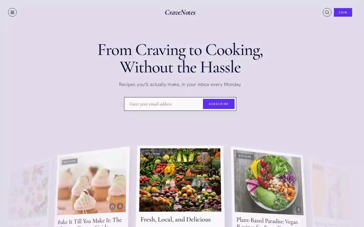
Fan (default). Cards spread out in an arc under the headline. Visitors turn the fan by dragging, swiping, scrolling sideways or with the arrow keys, and click the middle card to open it. Five cards show at first, and the rest come into view as the fan turns.
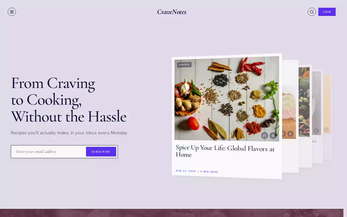
Stack. A pile of cards next to the headline. Swipe or drag the top card away to see the next one, or use the arrow keys. Every hero post is in the pile. On phones it moves under the headline.
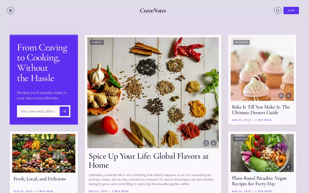
Front page. Laid out like a newspaper. Your headline and signup sit in an Accent-colored tile next to one big lead story (with its excerpt) and three smaller ones. It uses the first four hero posts.
None. Just the headline, subheadline and signup form. No posts.
If nothing matches (no Featured posts and no Hero posts tag), Fan and Stack fall back to the headline and form, and Front page shows the Accent tile on its own.
Hero posts
Hero posts takes a tag slug. Every post with that tag goes into the hero (up to 100), newest first. Leave it empty and the hero uses the posts you've marked Featured in the post settings. A tag is useful if you want to change the hero without touching Featured, since Featured also puts a flame badge on the card.
Previewing the layouts
Can't decide? The theme comes with a page template for each layout (Homepage Fan, Homepage Stack and Homepage Front Page), so you can compare them without touching your settings:
- Create a new page. What you put in it doesn't matter.
- In the page settings, under Template, choose one of the homepage templates.
- Publish it and open it. You'll see your whole homepage with that hero, and everything else as you've set it.
Once you've picked one, delete the pages or leave them unlisted.
Featured Topic
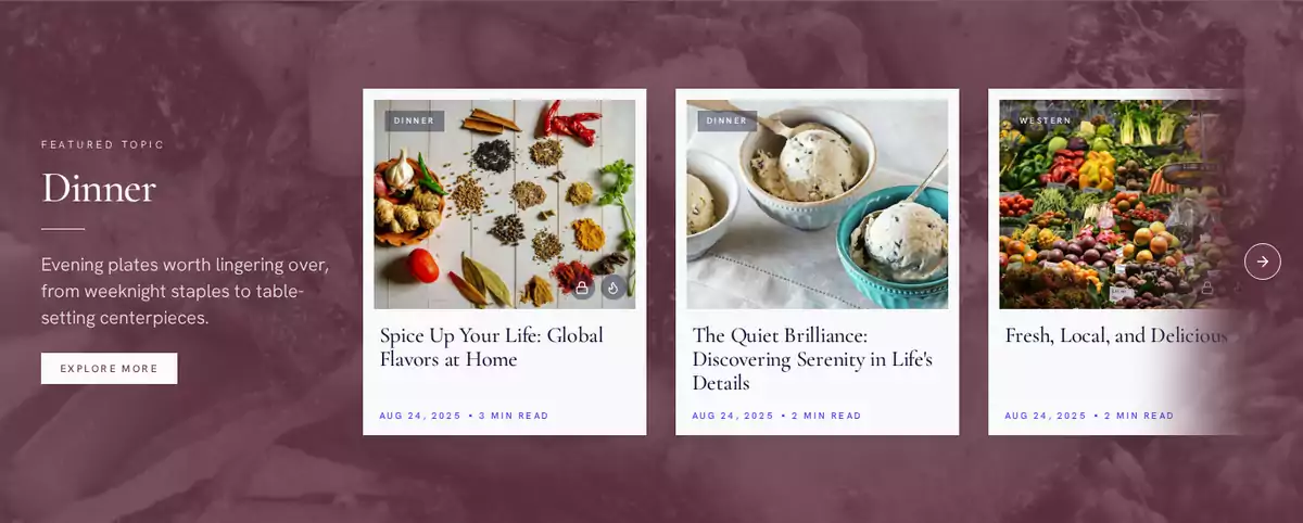
Featured topic takes a tag slug, such as summer-cocktails. The homepage then shows a full-width band with:
- a small Featured Topic label, the tag's name and its description (from the tag settings);
- an Explore More button linking to the tag page;
- up to 12 of the tag's newest posts in a sideways row, with arrows on wide screens and swiping on phones.
The band takes the tag's Color from the tag settings, or your Accent color if the tag doesn't have one. A tag image shows through in grayscale under the color. The text turns light or dark by itself, depending on the color behind it.
Leave it empty to hide the section. It also hides if no tag has that slug. Use the slug, not the name: summer-cocktails, not Summer Cocktails. You'll find it under Tags → (your tag) → Slug.
Explore more topics

Explore topics is a comma-separated list of tag slugs with no spaces, such as breakfast,dinner,vegan. Up to five show, as chips linking to each tag page.
- Leave it empty to show your five most-used tags.
- Each chip shows the tag's image. If the tag has none, it borrows the image from the tag's newest post, and failing that, shows a plain placeholder.
- Slugs that do not match a tag are skipped.
Latest Posts
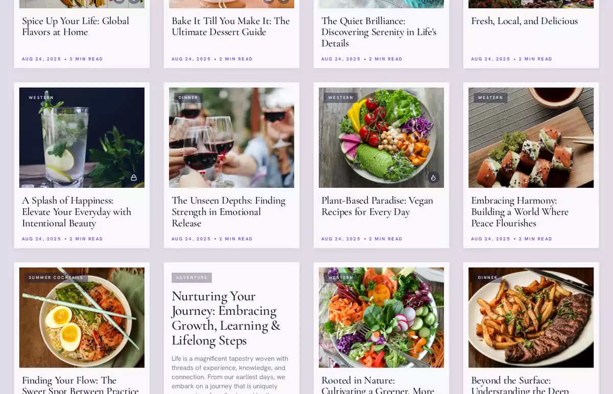
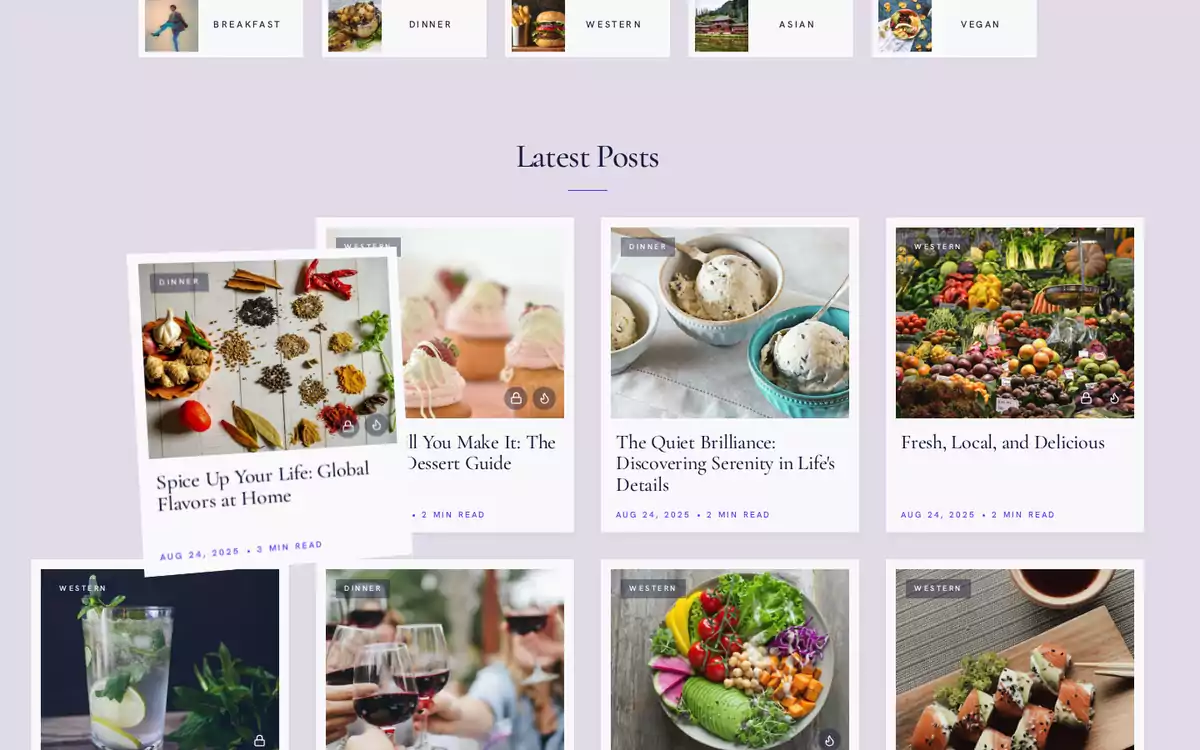
The grid shows every published post, newest first, under a heading with the post count.
- Grid columns: 2, 3 or 4 columns on wide screens. Tablets and phones use fewer columns on their own.
- Twelve posts load at a time. Load more brings in the next twelve without leaving the page. Underneath it's an ordinary link to the next page, so it still works without JavaScript and search engines can follow it.
Cards
Every card shows the post's feature image, its first tag, title, date and reading time.
- Photos are cropped to 5:4, so keep the subject near the middle.
- A post without a feature image gets a text card with its excerpt.
- A flame badge marks Featured posts.
- A lock badge marks members-only or paid posts the current visitor cannot read yet.
You'll see the same cards on the homepage, tag and author pages, and under each article.
About section
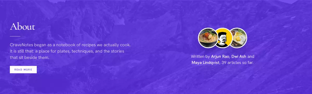
The About section is a band in your Accent color near the bottom of the homepage. It takes a minute to set up:
- Create a page (for example About) and publish it.
- Give it a title, an Excerpt (page settings) and, if you like, a Feature image.
- Enter its slug, for example
about, in About page.
The band shows the page's title and excerpt, with a Read more button. The feature image shows through in grayscale. Leave About page empty if you don't want the section.
- About authors (on by default): shows up to six of your authors as overlapping portraits, with a line such as Written by Maya, Arjun and Dwi, 27 articles so far. Each name links to the author's page. Authors without a profile picture show their initial. With more than six authors, the line ends with and others.
- About audience: Visitors only (default) hides the band from signed-in members, since they already know who you are. Everyone shows it to everybody.
Reading an article
Article motion
When a visitor clicks a card, Article motion decides what happens:
- Quick Flip (default): the card lifts, flips over and flies to the middle of the screen, and the article opens in its place. Close it (back arrow, Escape or the browser's Back button) and the article drops away while the list fades back in, right where you left it.
- Reduced: the article just slides in.
- Off: a normal page load, no animation.
If a visitor has reduced motion turned on in their device settings, they get the calm version whatever you choose. And every article is still a real page with its own address, so links, bookmarks, Back and Forward, search engines and sharing all work normally.
The article page
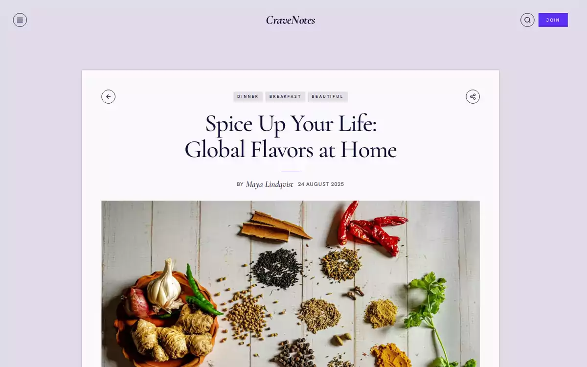
- Toolbar: a back arrow, the post's tags and a share button. Share opens Ghost's share window, or the device's share sheet if that isn't available, or copies the link as a last resort.
- Title, authors and date. Several authors are joined with &, and each name links to the author's page.
- Feature image, with its caption shown as a photo credit in the bottom-left corner. The photo darkens a little on hover so the credit stays readable. Put the credit in the image's caption field in the editor.
- Content, styled for every Ghost editor card (see Editor cards).
- Comments, when comments are on in Ghost.
Related posts
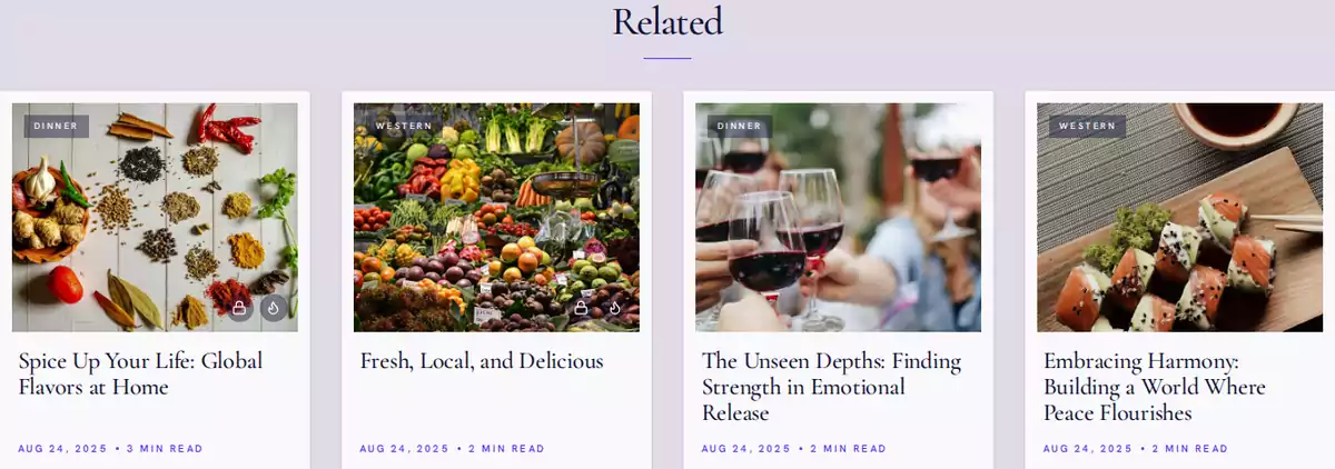
Under each article you'll find up to four posts that share its first (primary) tag. If the post has no tags, it shows the four newest posts instead. No related posts, no section.
Members and paid posts
Membership is set up in Ghost (Settings → Membership). When it is on, the theme adds:
- Join in the header, which becomes Account once signed in.
- Signup forms in the hero, the footer and the menu. Signed-in members do not see them, and the footer's signup block disappears for them.
- A message after someone signs up: "check your inbox" if it worked, or Ghost's own error if it didn't.
Paid and members-only posts
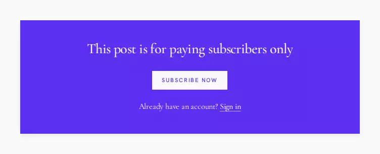
Someone without access sees the excerpt (if there is one) and the free preview, then a panel in your Accent color asking them to subscribe or sign in. Ghost decides who gets in; the theme never shows locked content. Cards for locked posts get a small lock badge.
Comments
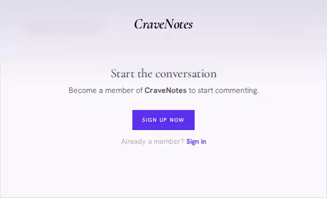
Comments are Ghost's own, turned on in Settings → Membership → Commenting. They pick up the theme's fonts and colors. Email delivery and payments are handled by Ghost, not the theme.
Before you go live, have a look at the site three ways: logged out, as a free member and as a paid member.
Tag pages
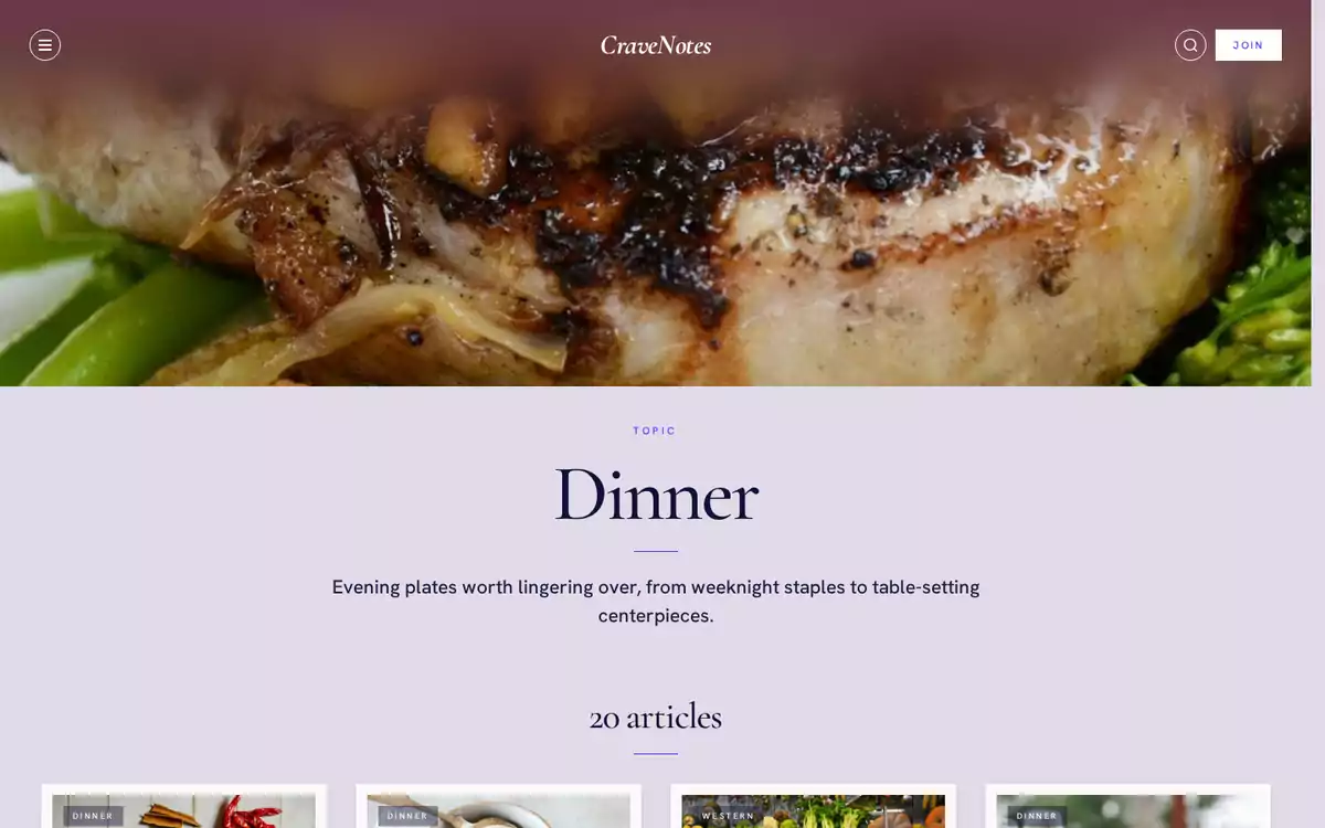
Every tag has a page at /tag/slug/ with:
- a Topic label, the tag's name and description;
- the date of its newest post and its post count;
- all its posts in the card grid.
Give the tag an image and the header becomes a full-width photo. It starts as a soft blur and sharpens once the full image loads, and the header bar picks up the photo's color. A tag Color tints the header as well. Ghost has no caption field for tag images, so there's no credit on these.
Author pages
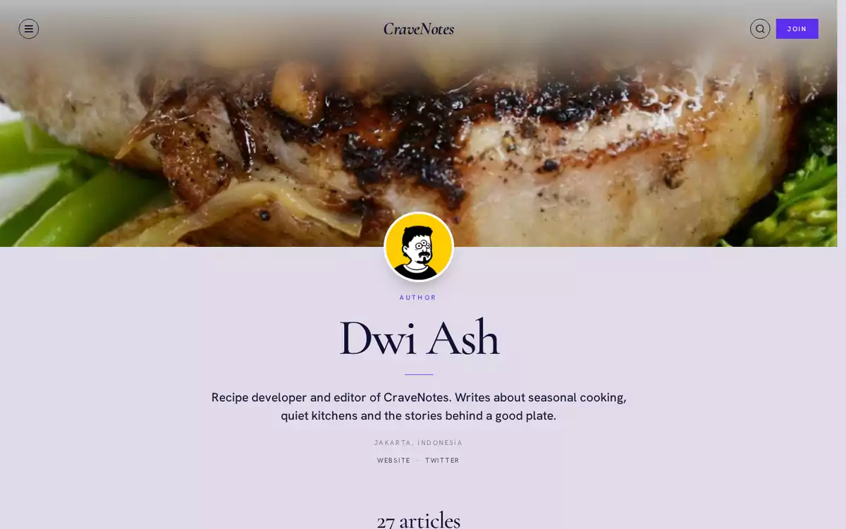
Every author has a page at /author/slug/ with:
- the cover image as a full-width header, when set;
- the profile picture, or the author's initial when there is none;
- an Author label, name, bio and location;
- links to their website, X (Twitter) and Facebook, when filled in;
- their post count and all their posts.
Edit these in Settings → Staff → (author).
Static pages
Pages get a quiet reading layout. The Show title and feature image switch in the page settings controls the top: turn it on for the title, excerpt and feature image (with credit), or off to start straight with your content. Off is nice for pages you build entirely in the editor.
Header and menu
Header
The header holds the menu button, your logo, search and Join or Account.
- Logo: the one from Design & branding. No logo? Your publication title shows instead, in bold italic in the heading font. Wide logos with a transparent background look best.
- Search opens Ghost's built-in search.
- The header tucks away when you scroll down and comes back the moment you scroll up. Over a dark tag or author photo, its text turns white.
Menu
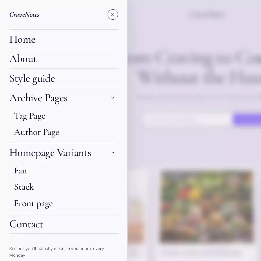
The menu button opens a side panel with your primary navigation (Settings → Navigation), and the signup form or Account button at the bottom. It closes with the × button, Escape or a click outside, and keyboard focus stays inside it while open.
Nested menus. Ghost's navigation is a flat list, so CraveNotes uses a small trick: put the parent first, then the items that belong under it with labels starting with - (a dash and a space). For example, in Settings → Navigation:
- Label
Recipes, URL/tag/recipes/ - Label
- Breakfast, URL/tag/breakfast/ - Label
- Dinner, URL/tag/dinner/
A parent with children gets an arrow to open and close its group. Give the parent the URL # if you want it to be a heading rather than a link. Without JavaScript, everything still shows as one plain list.
Footer
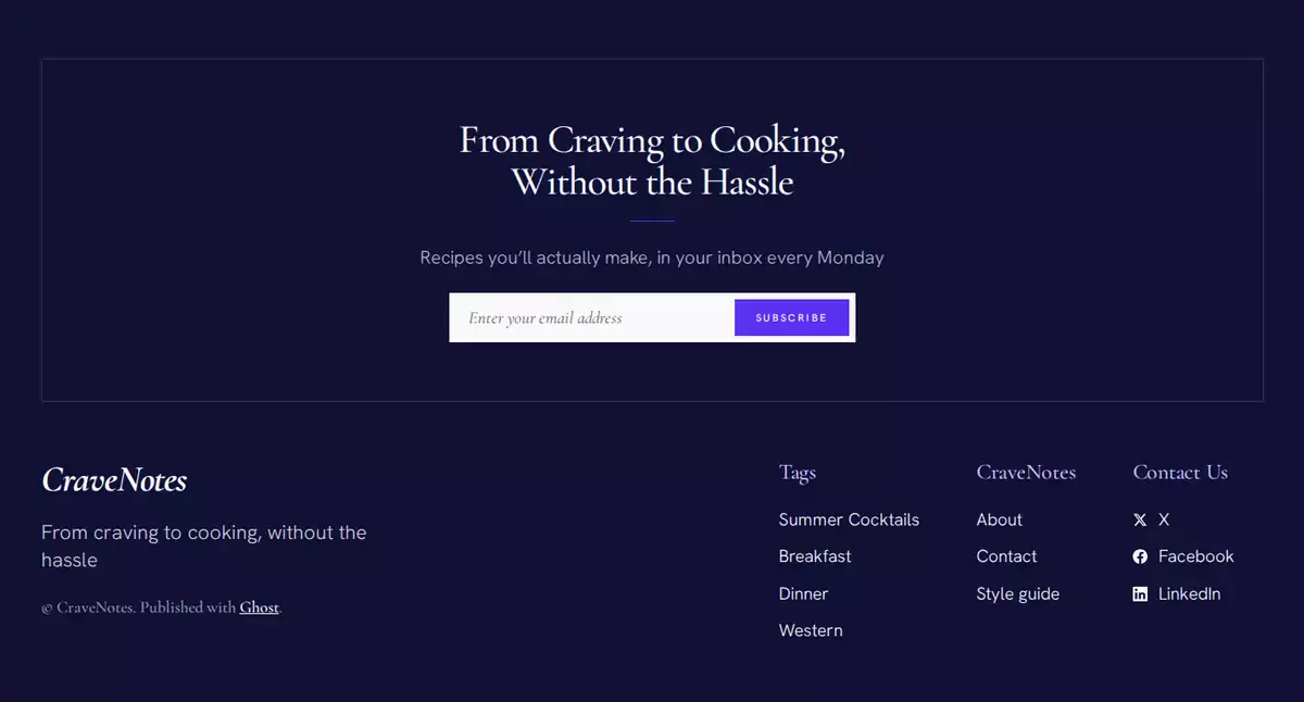
The footer has, from top to bottom:
- Signup block: the Hero headline, subheadline and signup form. Hidden for signed-in members; without membership it shows the two lines alone.
- Brand: your logo, drawn as a light silhouette so any logo reads on the dark footer (or the bold italic wordmark), and your publication description underneath when you have one.
- Copyright and the Published with Ghost credit.
- Link columns from your secondary navigation. A parent with the URL
#starts a column, and items starting with-go under it, the same trick as the menu. - Contact Us: your social accounts from Settings → General → Social accounts: X, Facebook, LinkedIn, Bluesky, Threads, Mastodon, TikTok, YouTube and Instagram, in that order. Empty accounts are skipped, and the column hides when there are none.
The footer background is always your Ink color.
Design
Colors
Three colors set the whole palette:
- Paper color (Theme tab, default
#f3eee6): the page background. Card, band and panel colors are mixed from it. - Ink color (Theme tab, default
#1a1714): text and the footer. Softer text, borders and shadows are mixed from it. - Accent color (Design & branding → Brand): buttons, labels, links, the About band, the Front page tile and the paid-post panel.
Keep Paper and Ink far enough apart, and make sure white text is readable on your Accent color. After changing colors, look over the homepage, an article and the footer with your own eyes.
Fonts
Headings are set in Cormorant Garamond and body text in Hanken Grotesk. Both ship with the theme, so your visitors' data never goes to a font service. If you'd like different fonts, Ghost's Heading font and Body font settings (Design & branding → Brand) override them.
Images
Ghost resizes every image for each place it appears, and photos fade in from a small blurred copy. Sizes that work well:
- Post feature image: at least 1400 px wide, landscape. Cards crop it to 5:4; the article shows it whole.
- Tag image: at least 1400 px wide. Used for the tag header, the Featured Topic band and topic chips.
- Author cover image: at least 1400 px wide, for the author header.
- Profile picture: square, at least 256 px. Used on the author page, article byline and About band.
- Page feature image: at least 1400 px wide. Used for the page header and the About band.
- Logo: a wide, transparent PNG or SVG, for the header, menu and footer.
Captions on post and page feature images, and on image cards in your content, show as a credit on the photo's bottom-left corner.
Image format: Original (default) keeps your files as they are. WebP serves card and header photos as WebP, which are smaller and load faster. The photos get re-encoded, so give them a quick look after you switch.
Editor cards
Every card in Ghost's editor has been styled to fit: images (normal, wide and full width), galleries, headers, callouts, toggles, quotes, buttons, call to action, bookmarks, products, audio, video, files, embeds and signup cards. A page with one of each is a good way to check your colors. The demo has one, called Style guide.
Private site and error pages
- Private site (Settings → General → Make site private): visitors see a password page with your title and a password field.
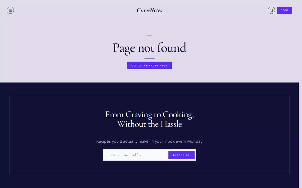
- 404: a Page not found page with a button back to the front page, inside your normal header and footer.
- Server errors: a plain page in your language with a link to the front page.
On phones and tablets
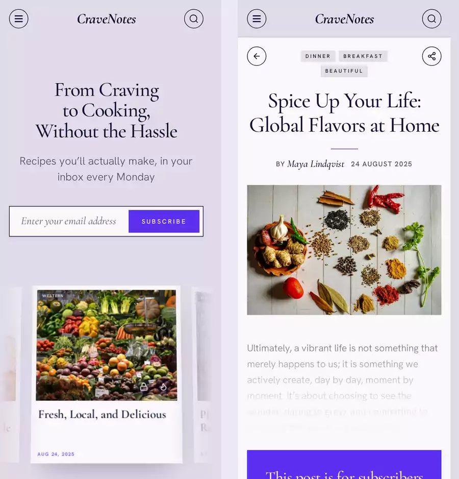
Everything adjusts to smaller screens. The hero layouts stack up, rows of cards become swipeable, the grid drops to fewer columns and the menu takes the whole screen. On phones, an open article fills the screen under the header bar.
Translation
All the words the theme adds itself (buttons, labels, messages) live in locales/en.json.
- Copy
locales/en.jsonto the file for your language, for examplefr.jsonorpt-BR.json. - Translate the values. An empty value falls back to the English key.
- Keep the
%in lines like% articles; it is replaced by the number. - Upload the theme again, and set Publication language in Settings → General.
Your posts, menu labels and theme settings are written in Ghost Admin, so they don't go in this file.
Settings reference
All theme settings are in Settings → Design & branding → Theme.
- Paper color (default
#f3eee6): page background; cards and bands are mixed from it. - Ink color (default
#1a1714): text and footer; muted text and borders are mixed from it. - Grid columns (default 4): the article grid on wide screens, 2, 3 or 4.
- Hero layout (default Fan): Fan, Stack, Front page or None.
- Hero posts (default empty): tag slug for the hero posts. Empty uses Featured posts.
- Featured topic (default
summer-cocktails): tag slug for the Featured Topic band. Empty hides the section. - Explore topics (default
breakfast,dinner,western,asian,vegan): up to five tag slugs, comma-separated. Empty uses the five most-used tags. - Hero headline (default From craving to cooking, without the hassle): hero and footer headline. Empty uses the publication description.
- Hero subheadline (default Recipes you'll actually make, in your inbox every Monday): the line under the headline in the hero, footer and menu. Empty uses the built-in translated line.
- About page (default empty): page slug for the About band. Empty hides the section.
- About authors (default on): author portraits and byline in the About band.
- About audience (default Visitors only): Visitors only, or Everyone.
- Image format (default Original): Original or WebP for card and header photos.
- Article motion (default Quick Flip): Quick Flip, Reduced or Off.
The theme also uses these from Ghost itself: publication title, description, logo, Accent color, heading and body fonts, primary and secondary navigation, social accounts, publication language, membership, comments and the private-site setting.
Customizing the code
The full source is in the ZIP, so you (or your developer) can change anything you like. You'll need Node.js 22.
- Unzip the theme and run
npm ciin its folder. - Edit styles in
src/css/(one file per part of the site) and scripts inassets/js/. Do not editassets/css/screen.cssorassets/built/; they are generated. - Run
npm run buildto rebuild. - Run
npm test. It checks the build and runs GScan, Ghost's official theme validator, for Ghost 5 and 6. Fix anything it reports. - Run
npm run zipto createdist/cravenotes.zip, and upload it.
docs/development.md explains how the pieces fit together. Working with an AI coding assistant? Point it at AGENTS.md. It says where each kind of change goes and which rules keep the theme compatible with Ghost.
Keep a copy of your changes somewhere safe. Uploading a new version of CraveNotes replaces them.
Troubleshooting
- A homepage section is missing. Check that the setting has the slug (not the name), that the tag or page is published, and that the tag actually has published posts. Remember the Featured Topic and Explore topics defaults are from the demo.
- The hero shows no cards. Mark some posts as Featured, or set Hero posts to a tag that has posts. (With Hero layout set to None, there are no cards on purpose.)
- I can't see the About section. With About audience on Visitors only, signed-in members don't see it, and that includes you if you're signed in as a member. Try a private window.
- No signup forms or Join button. Either membership is off, or you're signed in as a member.
- The menu shows `- Breakfast`, dash and all. The parent has to come right before its children, and the label needs a dash followed by a space.
- Photos stay blurry or look stretched. Your storage needs to support Ghost's resized images (
/size/w20/). The full image still loads either way. - My style changes don't show up. Edit
src/css/, runnpm run build, upload the new ZIP, then do a hard refresh. - Text is hard to read. Nudge Paper, Ink or Accent until the contrast feels comfortable.
- Signup doesn't work. Read the message Ghost shows under the form, then check your email settings in Ghost.
Help
Stuck? Email [email protected] and I'll help. It speeds things up if you include your Ghost and theme versions, the page address, your browser and what you did before it went wrong. Please don't send Admin passwords, member data or database exports.